 Curator
10 August, 2026
Curator
10 August, 2026
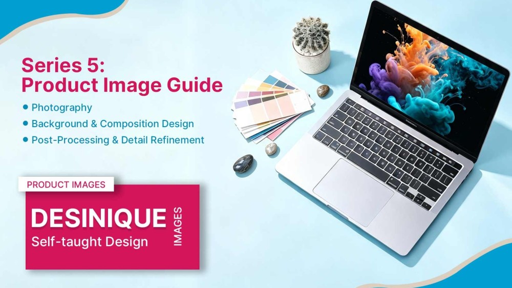
self-taught graphic designer roadmap | Series 5: Product Image Guide
Hi everyone, I'm Desinique, a self-taught designer. I can't draw, I don't have a design degree—I've been doing this for 18 years, entirely through self-study. I want to share my working experience with those who are also trying to teach themselves design, or make a career switch.
We've already covered the four most important series of knowledge in graphic design: Color, Background, Detail, and Typography. Today, we're moving on to the fifth—and final—piece of a complete design: the Product Image. Throughout all these years of work, product images have always been around me. At the very beginning, a simple cutout was enough; then came the need for proper photography; later, color grading and retouching in Photoshop. Although our company now has dedicated product designers, for at least the first 14 years, it was a constant challenge that never quite left my side.
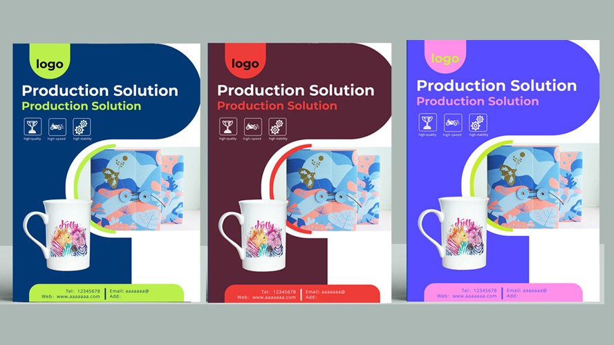
The product image directly determines the overall presence of a design. It's the most critical element—it shapes the client's first impression of the product and directly influences their purchase intent. So clarity, cleanliness, and a sense of quality are essential. We can use light and shadow to highlight the fineness of materials, letting the product speak for itself. Alternatively, we can use AI processing (though for print work, it may fall short; for web use, it's generally fine). If you have the time, you can always refine it by hand.
1. Photography Image Clarity & Resolution Ensure high resolution: Product images should use at least 300 dpi for both print and high-definition screen display. Avoid compression artifacts: When exporting, use lossless formats like PNG or TIFF, or carefully control the compression quality for JPEGs. Accurate focus: Ensure the main subject is sharp during capture, avoiding blur or out-of-focus areas—especially on fine details.
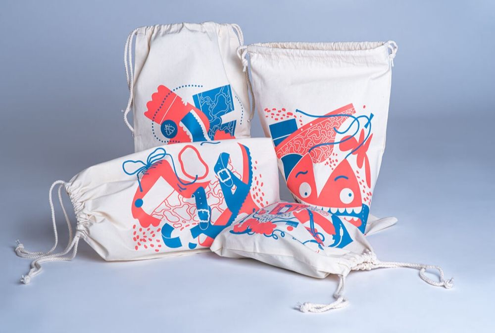
Lighting & Color Reproduction Use diffused lighting: Softboxes or ring lights help minimize harsh shadows and bring out the product's contours and material details. Set the white balance correctly: Avoid color casts to ensure the product's colors are accurately represented, building trust with the viewer. Keep color grading consistent: When processing in batches, maintain uniform tonality that aligns with your brand's visual identity.
2. Background & Composition Design Keep the background clean: Go with pure white, gradient gray, or contextual settings that don't distract from the subject. Leave reasonable negative space: Follow the "Rule of Thirds" or "Golden Ratio" for a well-balanced composition. Show multiple angles: Provide front, side, and close-up views to give a complete picture of the product.
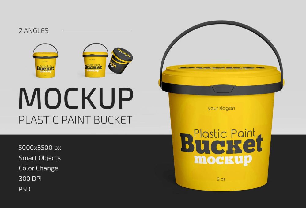
3. Post-Processing & Detail Refinement Retouch imperfections: Remove dust, fingerprints, specular spots, and other minor blemishes. Refine edges: For cutouts, ensure precise selections with properly feathered edges for smooth transitions—avoid jagged lines or fringing. Add shadows and reflections: Apply drop shadows to enhance depth, but keep them physically realistic.
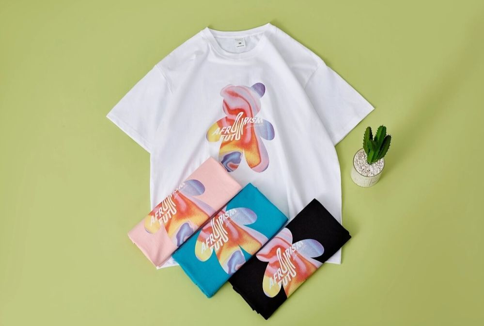
4. Brand Tone & Style Consistency Maintain visual coherence: The style of your product images—including filters, borders, and layout—should be consistent with your overall brand image. Overlay information thoughtfully: If adding text or labels, pay attention to typography, colors, and placement so they don't overpower the product itself.

Dear friends, that brings us to the end of the five-series journey through graphic design. Every point shared here is a summary of my 18 years in the field. Though this has been an overview, I'll go deeper in the future—on how to approach a design, how to get projects approved quickly on the first try, how to develop your aesthetic sense, and how to build confidence as a beginner.
That's all for this post. In the next one, we'll talk about how to go from being a "software novice" to actually making a living through design. See you tomorrow~
Popular