 Curator
31 July, 2026
Curator
31 July, 2026
self-taught graphic designer roadmap in Photoshop Series #1 – Color Palette Basics
Hi everyone, I’m DesiNique, a self-taught graphic designer with 18 years of professional experience. Yesterday, we briefly covered the five core areas self-taught graphic designers need to master: color palette, details, backgrounds, typography, and product imagery. Today, let’s dive deeper into color palette.
In any design work, color palette comes into play at two key stages: the start and the finish. At the beginning, during ideation, you decide which primary hues will anchor your composition; this choice defines the overall style and direction. After the layout is fully assembled, review the work with a fresh eye and ask yourself whether an alternative palette would perform better. Then select the most visually pleasing option.
I. Color Harmony Color harmony describes the visually cohesive, balanced, comfortable effect created when different colors work together. It is not simply repeating a single hue. Instead, you organize hue, brightness, saturation, and area proportions in a deliberate sequence so multiple colors coexist in one composition. The result feels neither jarring and chaotic nor flat and monotonous, delivering a satisfying aesthetic experience. The main approaches to achieving color harmony are as follows:
1. Analogous Colors Colors adjacent on the color wheel, such as red and orange, or blue and green. Because their hues are closely related, transitions feel natural. This creates soft, unified visuals and is one of the most common, low-risk ways to build harmony.
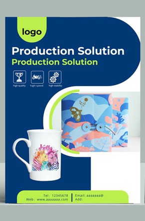
2. Complementary Colors Colors positioned opposite each other on the color wheel, such as red and green, blue and orange. The contrast is inherently strong, but you can reduce tension by adjusting brightness or lowering saturation. This yields dynamic, balanced harmony.

3. Monochromatic Colors Variations of a single hue in different depths, for example light red, medium red, and deep red. This scheme relies on gradients of brightness and saturation to build layers while remaining highly unified.

4. Achromatic + Chromatic Colors Pairing neutral tones such as black, white, gray, gold, or silver with chromatic colors. Neutrals effectively mediate the composition, improve overall cohesion, and prevent color clashing.

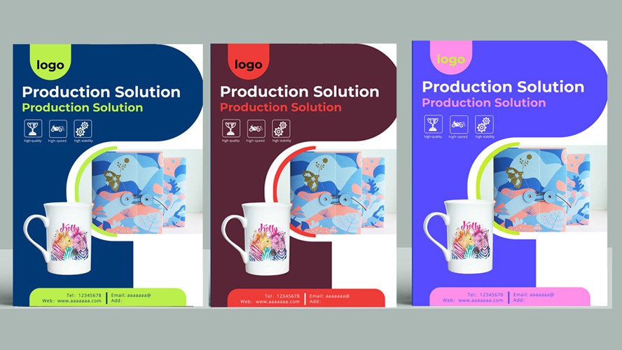
II. Color Palette and Brand Value Finance & Trust: Blue as a Signal of Authority Palette logic: Deep blue + white / silver gray Values communicated: Stability, security, professionalism Ecology & Sustainability: Green’s Natural Resonance Palette logic: Pale emerald + natural wood tone / white Values communicated: Wellness, ecology, renewability Luxury & Prestige: Timeless Black and Gold Palette logic: Matte black + metallic gold / subtle crimson accents Values communicated: Classic, exclusive, premium Innovation & Vitality: Purple as a Forward-Looking Statement Palette logic: Deep violet + bright pink / violet gradients Values communicated: Distinctive, creative, youth-oriented Health & Healing: Clean White and Pale Blue Palette logic: Pure white + light blue / soft gray Values communicated: Clinical, sterile, reassuring Children & Growth: Cheerful Pale Yellow and Sky Blue Palette logic: Bright yellow + sky blue + white background Values communicated: Optimism, safety, curiosity Athletics & Challenge: Energetic Orange and Black Palette logic: Vivid orange + black / gray Values communicated: Passion, breakthrough, self-mastery
Popular