 Curator
13 August, 2026
Curator
13 August, 2026
self-taught graphic designer roadmap: Mastering Color Blocking Principles
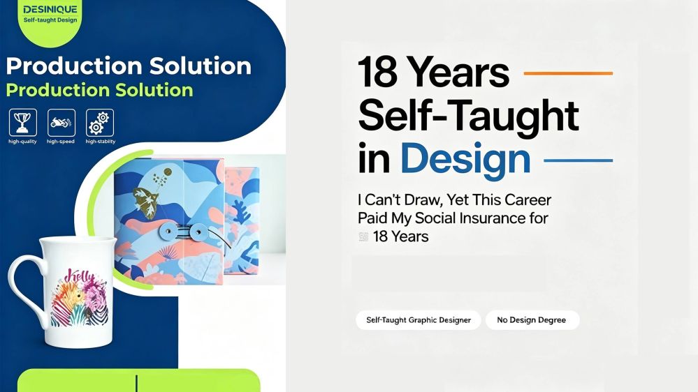
Hello everyone, I'm Desinique. If you're looking for fancy effects and complex synthesis, I'm not your pitch. But if you want to create practical, commercial designs using just 1/3 of the simplest tools—and build your ultimate survival skill—that's my specialty.
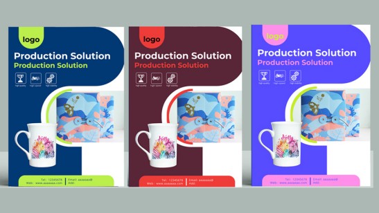
Today, let’s talk about color blocks. To me, what is self-taught graphic design, really? My work has always been "flat"—no complex 3D, no fancy special effects. Just clean, honest, truly flat graphic design. Yet, this very "flatness" has steadily provided a solid living for me for nearly 20 years. Here, I’m breaking down everything I’ve learned over all these years, once and for all.
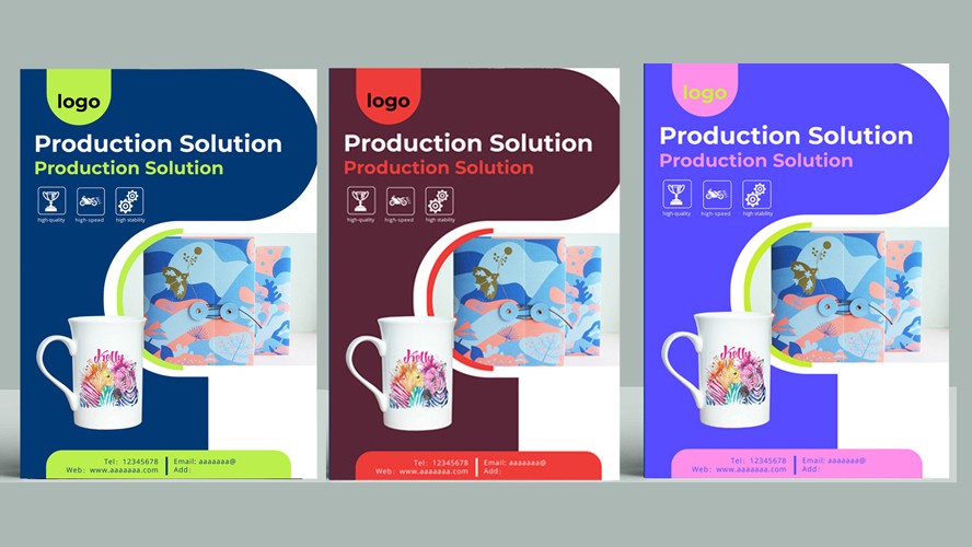
1. What Graphic Design Means to Me: Mastering "Accent & Frame Color Blocks" In my view, the first step in graphic design isn't showing off complex tricks—it’s fully understanding how to use color blocks (color blocking). Color blocks are not just colors; they are the framework of a layout, the steps for information hierarchy, and the breathing room for visual pace.
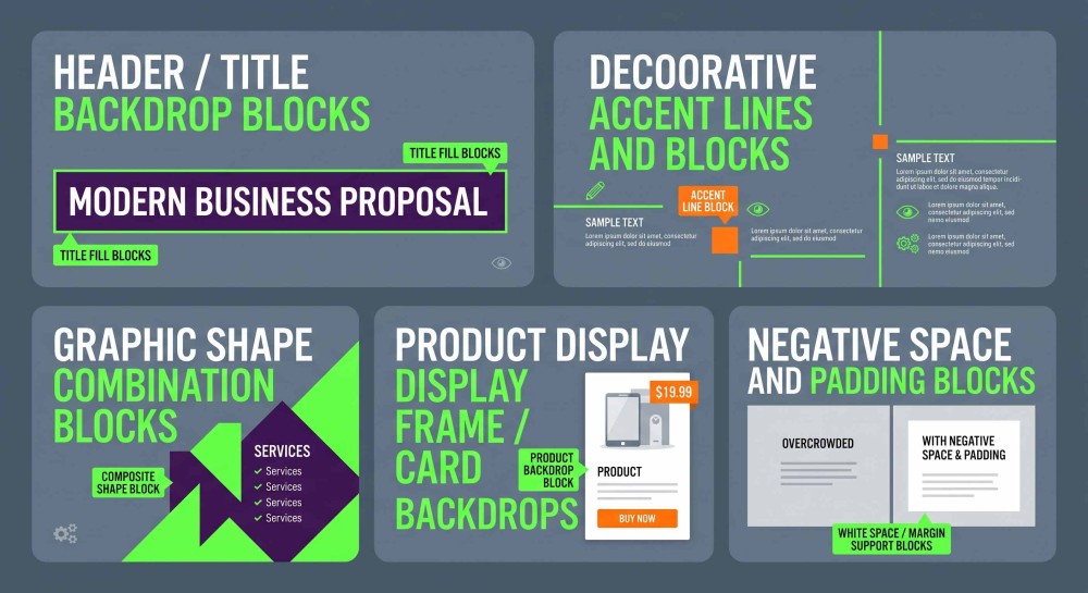
The main types of color blocks I use: Header / Title backdrop blocks(Title Fill Blocks) Decorative accent lines and blocks(Accent Line Blocks) Graphic shape combination blocks(Composite Shape Blocks) Product display frame / card backdrops(Product Backdrop Blocks) Negative space and padding blocks(White Space / Margin Support Blocks)
How to use color blocks effectively comes down to these two levels of logic: 1. Logical Hierarchy Progressing from core function $\rightarrow$ detail refinement $\rightarrow$ creative composition $\rightarrow$ unified color palette. Step by step, moving from simple, to visually appealing, to high-end design.
**2. Value Elevation** Color blocks are far more than just "layout tools." They are a medium to express emotion, convey brand tone, and bring warmth to your design.
That’s all for today. Next time, we’ll dive into the details of design.
Popular