 Curator
6 October, 2026
Curator
6 October, 2026
Practical Graphic Design: A Beginner’s Guide to Minimalist Color Palettes
One of the most common pitfalls for self-taught designers is the urge to throw every shade into a single canvas, assuming more colors mean a more sophisticated look. In reality, an overcrowded palette muddles visual hierarchy and drives viewers away. Designed specifically for beginners, this guide breaks down Practical Graphic Design: 极简颜色搭配法 with intuitive frameworks that help you stop second-guessing color choices and start creating sleek, high-impact visuals right away.
When you are starting out, complex color theory and endless swatch panels can feel paralyzing. If you want to overcome photoshop tool anxiety, the fastest shortcut is not memorizing the entire color wheel; it is ruthlessly capping your color count. Great graphic design thrives on intentional restraint. By limiting your primary palette to two or three carefully chosen shades, your message stays crystal-clear, which is the cornerstone of modern visual communication.
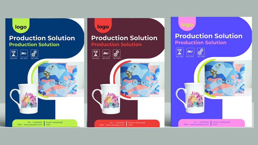
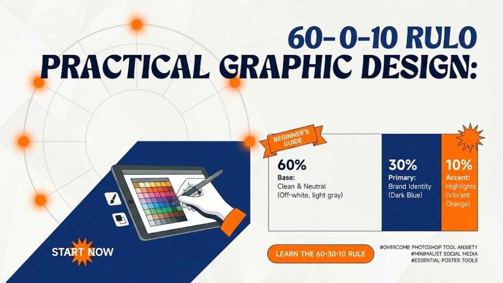
The simplest way to master minimalist color matching is the classic 60-30-10 rule. Allocate 60% of your canvas to a clean neutral base such as off-white or soft gray, 30% to a signature brand color like deep navy or forest green, and the final 10% to an eye-catching accent like vibrant orange or lime yellow to steer the viewer’s eye. This visual breakdown is especially effective for minimalist social media graphic design, cutting through cluttered social feeds in a fraction of a second.
Putting this into practice inside Photoshop does not require complicated workflows. To quickly nail your background and balance your values, navigate to the Layers panel on the bottom right and click the Create new fill or adjustment layer icon. Pick Solid Color to establish your primary surface, then introduce a Color Balance or Curves adjustment layer to dial in warm or cool undertones without compromising overall tonal clarity.
When creating event materials or promo graphics, taking advantage of essential photoshop tools for poster design makes harmonious coloring feel effortless. Simply grab the Eyedropper Tool to sample naturally balanced tones straight from high-quality reference photography. If an icon or shape lacks contrast, double-click the layer to open Layer Style and apply Color Overlay to unify vector assets with one click.
To protect visual harmony across your workflow, build a compact personal palette inside the Swatches panel. Steer clear of out-of-the-box, hyper-saturated default swatches. Desaturate your hues slightly, pair them with understated tones like slate gray or charcoal, and watch the perceived production value of your design jump dramatically.
Teaching yourself graphic design is fundamentally an exercise in subtraction. Rather than chasing intricate gradients and heavy effects, nail two-tone and three-tone combinations first. Never forget that seamless communication always comes before ornamentation. Once you internalize this minimalist color logic, even basic typography and geometric shapes will assemble into polished, timeless layouts.
Popular